Contact Us
or call us now 800.268.5620
In advertising and retail sales, color psychology is critical. Consumers tend to respond to color box packaging, which may attract or repel them. Depending on the demographics of your target market, the colors you pick for your package materials might make or break a product’s success.
While color psychology isn’t quite magic, it has the potential to have a near-mystical effect on your audience. Choosing the proper color box packaging to evoke the right emotions is a delicate balancing act that, when done well, may yield spectacular results.
Colors on product labels and packaging significantly affect customer purchase choices. Studies show:
Colour is still one of the essential aesthetic characteristics to consider, even though other considerations such as brand awareness and product quality play a role in purchase decisions.
In the product packaging sector, there are few prevalent color trends.
Color box packaging impacts customer buying behavior, according to Consumer Buying Behavior. There are a few factors to consider while choosing the best tint for your product packaging.
Your customers should be able to relate to the colors you select. Maintain a laser-like concentration on your target market. Recognize their requirements and motivations. What are their age, gender, socioeconomic level, and educational background? McDonald’s, for example, uses the iconic red and yellow color scheme to convey vitality and youthfulness to its target demographic.
You may want the package to inform the buyer about the product’s contents. The color of a shampoo bottle, for example, may provide the consumer with a signal about the product’s range.
The color should subtly express the message you wish to send to potential customers. Do you want people to think of the product as relaxing or enjoyable? Is the item connected to health or safety? The right color will trigger the corresponding emotions in the customers.
The colors and style of packaging should tell your brand’s narrative. Do you wish to highlight a positive aspect of your company? Is your brand serious, lighthearted, or rebellious?
Your colors should complement the package design and the typography you select. It doesn’t take much to get carried away with your creativity and go overboard, even though it may appear straightforward. The fonts you pick transmit a statement to your customers, and the colors you use should match that message.
Experimenting with color box packaging for a new product is fun, but you must retain color consistency and brand identification. It implies that regardless of the packaging or colors, customers should be able to recognize your brand.
Here are a few more things to think about when utilizing color box packaging:
If you have gender-specific items, the colors will automatically be distinguished. However, be mindful that gender-specific color expectations may differ. For example, females were drawn to product colors of blue, purple, and green, while men were drawn to blue, green, and black.
Your clients’ perceptions of color will differ based on their age, education, cultural background, and economic status. Therefore, pay close attention to how your target audience interprets color.
Make sure that your colors set you out from the competitors. Consumers will be confused if you appear to be someone else. Use color to make your company logo stand out on the shelf.
When picking package colors, keep your consumers and your brand in mind. Mood boards might be helpful if you’re rebranding or designing packaging for a new product.
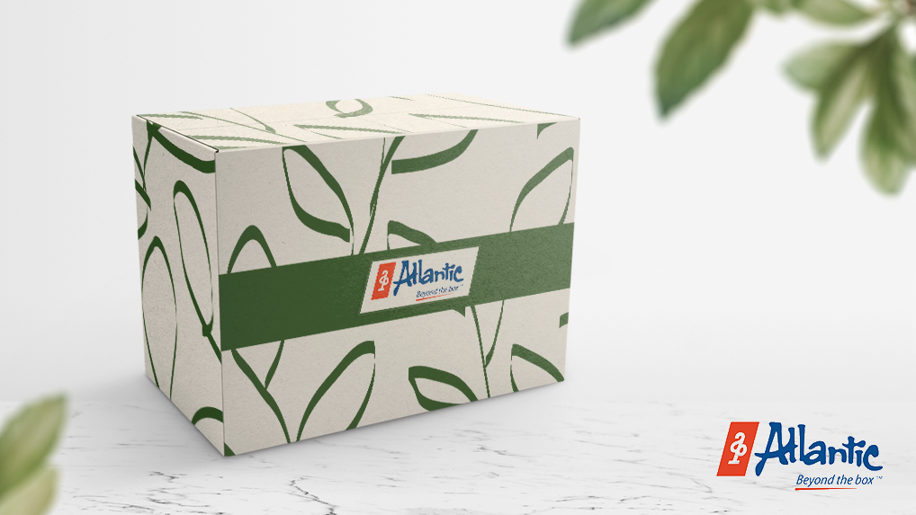
Is there anything more you’d want to know about colors? Have you experimented with different package colors for your product? Let’s start a dialogue with Atlantic Packaging if you’re trying to figure out the color for your packaging. Our team of specialists can assist you in creating a stunning package design.
Atlantic Packaging is here to help you with all of your packaging needs. Allow our experienced packaging solutions experts to provide you with color advice and design direction for your product packaging. Contact us at 1800-268-5620 today!
© 2025 Atlantic Packaging Products Ltd. All rights reserved.
Atlantic Packaging Products
We firmly believe that the internet should be available and accessible to anyone, and are committed to providing a website that is accessible to the widest possible audience, regardless of circumstance and ability.
To fulfill this, we aim to adhere as strictly as possible to the World Wide Web Consortium’s (W3C) Web Content Accessibility Guidelines 2.1 (WCAG 2.1) at the AA level. These guidelines explain how to make web content accessible to people with a wide array of disabilities. Complying with those guidelines helps us ensure that the website is accessible to all people: blind people, people with motor impairments, visual impairment, cognitive disabilities, and more.
This website utilizes various technologies that are meant to make it as accessible as possible at all times. We utilize an accessibility interface that allows persons with specific disabilities to adjust the website’s UI (user interface) and design it to their personal needs.
Additionally, the website utilizes an AI-based application that runs in the background and optimizes its accessibility level constantly. This application remediates the website’s HTML, adapts Its functionality and behavior for screen-readers used by the blind users, and for keyboard functions used by individuals with motor impairments.
If you’ve found a malfunction or have ideas for improvement, we’ll be happy to hear from you. You can reach out to the website’s operators by using the following email
Our website implements the ARIA attributes (Accessible Rich Internet Applications) technique, alongside various different behavioral changes, to ensure blind users visiting with screen-readers are able to read, comprehend, and enjoy the website’s functions. As soon as a user with a screen-reader enters your site, they immediately receive a prompt to enter the Screen-Reader Profile so they can browse and operate your site effectively. Here’s how our website covers some of the most important screen-reader requirements, alongside console screenshots of code examples:
Screen-reader optimization: we run a background process that learns the website’s components from top to bottom, to ensure ongoing compliance even when updating the website. In this process, we provide screen-readers with meaningful data using the ARIA set of attributes. For example, we provide accurate form labels; descriptions for actionable icons (social media icons, search icons, cart icons, etc.); validation guidance for form inputs; element roles such as buttons, menus, modal dialogues (popups), and others. Additionally, the background process scans all the website’s images and provides an accurate and meaningful image-object-recognition-based description as an ALT (alternate text) tag for images that are not described. It will also extract texts that are embedded within the image, using an OCR (optical character recognition) technology. To turn on screen-reader adjustments at any time, users need only to press the Alt+1 keyboard combination. Screen-reader users also get automatic announcements to turn the Screen-reader mode on as soon as they enter the website.
These adjustments are compatible with all popular screen readers, including JAWS and NVDA.
Keyboard navigation optimization: The background process also adjusts the website’s HTML, and adds various behaviors using JavaScript code to make the website operable by the keyboard. This includes the ability to navigate the website using the Tab and Shift+Tab keys, operate dropdowns with the arrow keys, close them with Esc, trigger buttons and links using the Enter key, navigate between radio and checkbox elements using the arrow keys, and fill them in with the Spacebar or Enter key.Additionally, keyboard users will find quick-navigation and content-skip menus, available at any time by clicking Alt+1, or as the first elements of the site while navigating with the keyboard. The background process also handles triggered popups by moving the keyboard focus towards them as soon as they appear, and not allow the focus drift outside it.
Users can also use shortcuts such as “M” (menus), “H” (headings), “F” (forms), “B” (buttons), and “G” (graphics) to jump to specific elements.
We aim to support the widest array of browsers and assistive technologies as possible, so our users can choose the best fitting tools for them, with as few limitations as possible. Therefore, we have worked very hard to be able to support all major systems that comprise over 95% of the user market share including Google Chrome, Mozilla Firefox, Apple Safari, Opera and Microsoft Edge, JAWS and NVDA (screen readers).
Despite our very best efforts to allow anybody to adjust the website to their needs. There may still be pages or sections that are not fully accessible, are in the process of becoming accessible, or are lacking an adequate technological solution to make them accessible. Still, we are continually improving our accessibility, adding, updating and improving its options and features, and developing and adopting new technologies. All this is meant to reach the optimal level of accessibility, following technological advancements. For any assistance, please reach out to